

Improving the Engagement and Interest of Members
Redesigning Theta Tau’s Website to Promote Community
Role
Lead Designer
Club
Theta Tau @UCSD
Team
5 Developers
4 Designers
Timeline
Apr-Oct 2023
Skills
User Research
Usability Testing
Visual Design
Interaction Design
Management
Tools
Figma
01
PROVIDING CONTEXT
Theta Tau: An Organization Aimed to Bring Engineering Students Together
Theta Tau aims to provide engineering students a community with access to networking opportunities, professional development, and lifelong friendships.
Their goal with their website is to keep their members engaged whilst attracting new members.
Image: The Original Website
But, the last time the website was updated was in 2018. How has that impacted their goals?
02
A QUICK GLANCE AT THEIR WEBSITE
A Lack of Visual Design and Organization
As a member of Theta Tau myself, I was highly aware of member’s dissatisfaction of the website’s interface and design.
For this project, I was tasked with redesigning the Brothers Page.
At first glance, I noticed a few issues:
The Brothers Landing Page does not indicate to the user where they’ve navigated to. Can we make it clear to the user where they’re located?
The hierarchy of information makes it difficult to discern what information is important. Can we organize the information so it’s easy to read?

Image: The Original Website
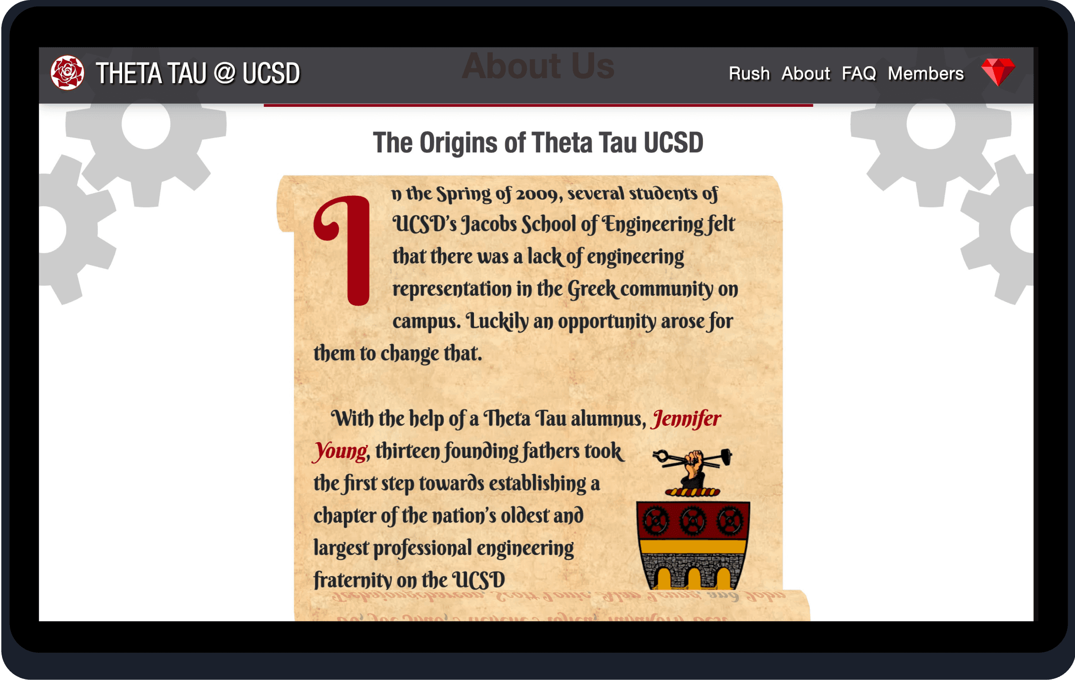
Image: The Original Website
In general, many members often make comments on how the website looks outdated and old.
Before actually designing solutions, we first have to see what research can uncover.
03
GATHERING DATA
What do the Users Think About the Website?
For this project, we collected 35 survey responses from current and prospective members on their understanding of the purpose of the website, as well what they expect on each page.
The Data Said...
37%
of users wanted more personal information about members
60%
of users described the website as old and outdated
50%
of users interact with the Brothers Page the most
Noteworthy Quotes
“I think adding personal info about the members like hobbies and such would better communicate Theta Tau’s values to prospective members”
“The Brothers Page is difficult to navigate.”
“I couldn’t really find any accurate information or pictures of the current members because the website wasn’t updated.”
“The website doesn’t incite exploration and it has an outdated font.”
How can we implement what we gathered and use data to inform our solution?
04
A DATA DRIVEN SOLUTION
So, What's the Solution?
Add Personal Bios
Adding personal bios where members can express their interests and passions would make users interested in learning more about Theta Tau.
Reorganize Information
Cleaning up and reorganizing the layout on the Brothers Page would make it easier to navigate and find information.

Image: The Original Website
05
ITERATING… OVER AND OVER AGAIN
Initial Wireframes
My team and I started with some lo-fi wireframes, got some feedback, and repeated the process.

Image:Brothers Landing Page Wireframe

Image:Member Blurb Wireframe
What Was Changed?
A large banner to help users understand which part of the website they’ve navigated to
Adding Member Blurbs to give a more personal feel to the website
Overall cleaner UI and Visual Design
Getting Feedback
During our weekly team meeting, I ran my initial design by my team, which was a total of 9 people (5 developers, 4 designers). Here’s what they had to say!

Image:Brothers Landing Page Wireframe

Image:Member Blurb Wireframe
Another Round of Iteration
After lo-fis and implementing feedback, I transitioned to some hi-fis and did A/B Testing to see which design users enjoyed more. For this round of testing, I asked 5 current members of Theta Tau to review my design of the Member Blurb.

Image: Version 1 of Member Blurb

Image:Version 2 of Member Blurb
80% of members preferred Version 2, stating that it was easier to read and Version 1 was harder to digest.
06
THE FINAL PRODUCT!
Theta Tau Website, Redesigned!
To view the full redesign, including all the other pages redesigned by my lovely team, please visit www.ucsdthetatau.com!

A landing page with a clear header.

Connecting with members on a personal level.
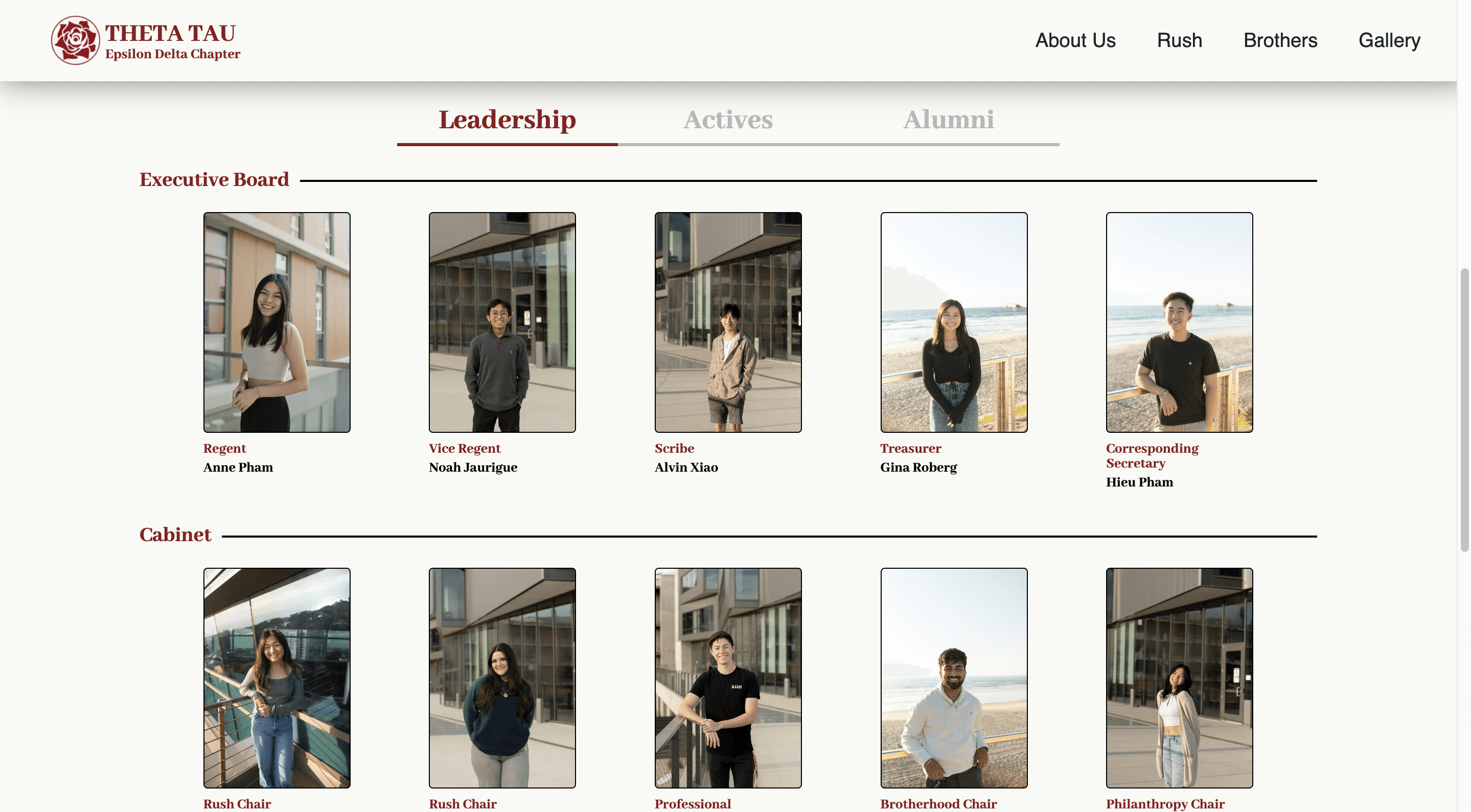
A simpler way to find the members of Theta Tau.
Demo
Reflection
Next Steps
If I had more time, I would've ideally spent more time doing user testing. Ultimately, if the users are not satisfied with the outcome, then that means my work as a designer was not successful, which is why I would want to test more.
What Did I Learn?
I learned a lot of time management through this project. There were multiple occassions where my team and I expected to get things done by a certain deadline, but when that deadline came around, we weren't finished. So I learned that things take time, and it's better to get things done earlier rather than later!
Giving Thanks!
This was my first ever design project, and my first ever time working with engineers, so for that I am proud of the outcome of our work!
I truly could not have done it without my team, so I wanted to give a special thanks to my developers Justin Chiang, Henry Liu, Amogh Manjunath, Jordan Peranginangin, and Andrew Tan.
An even more special thanks to my designers Jonathan Ly, Hieu Phan and Zander Vilaysane. I’ve learned so much from throughout them this project, and I seriously couldn’t have asked for a better team <3
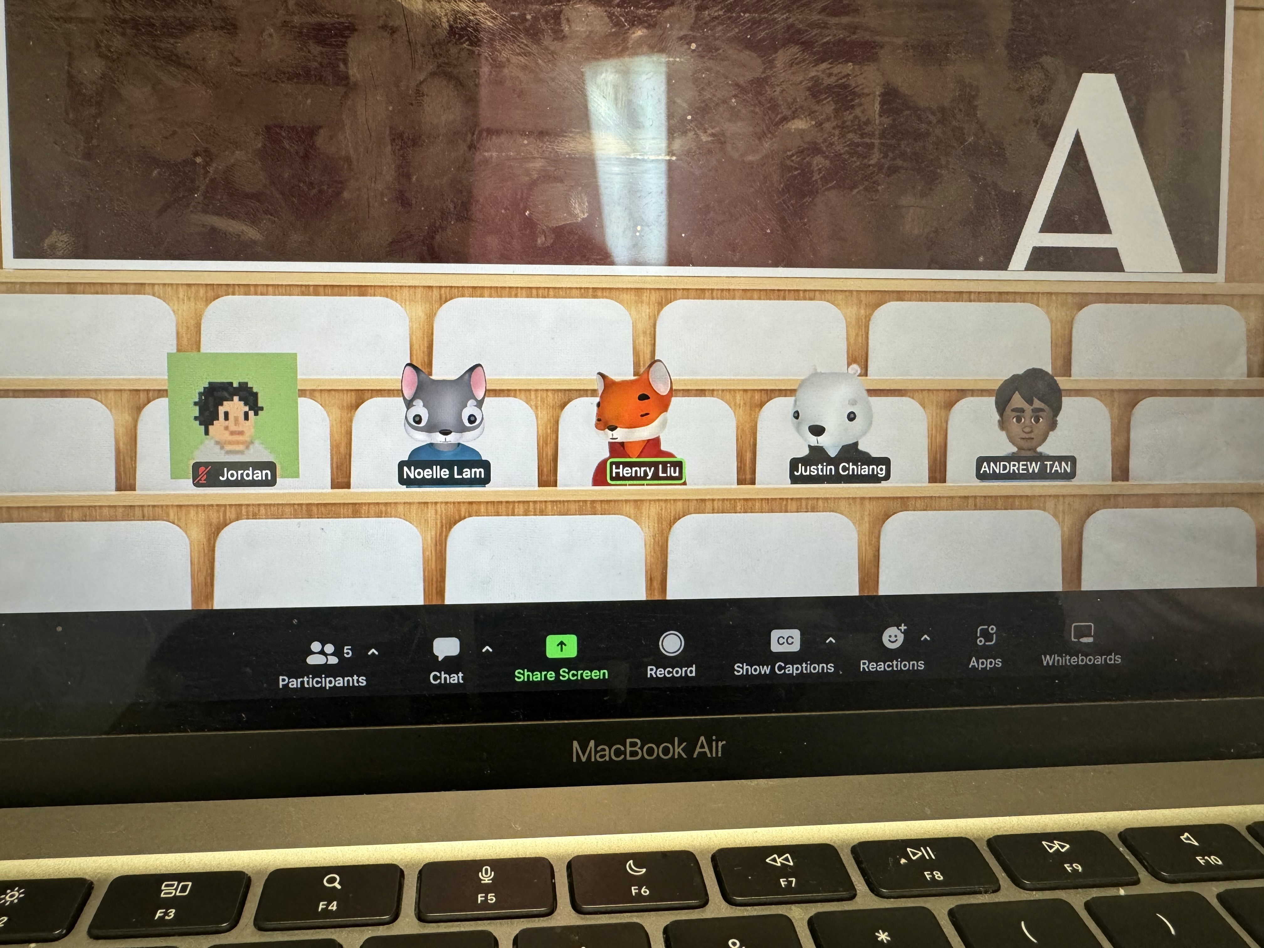
Image: One of many, many meetings